Comparison View and Shot Matching in the Lumetri Color Panel
Think of the Lumetri Color panel as a remote control for the Lumetri Color effect. Whatever you adjust in the panel affects the corresponding settings in the Lumetri Color effect. You could do the exact same adjustments in the Effect Controls panel, but the controls in the Lumetri Color panel are much easier to adjust, and they’re always available in the same place.
In the spring 2018 version of Premiere, Adobe introduced Comparison View in the Program Monitor, featuring both shot and frame comparison. This is a nice addition, so we don’t have to load the sequence into the Reference Monitor and the Source Monitor to compare shots.
This is an excerpt from an article I wrote for Frame.io on the Lumetri Color Panel. For the full article, with EVERYTHING there is to know about the Lumetri Color Panel, head over to Frame.io for a long read.

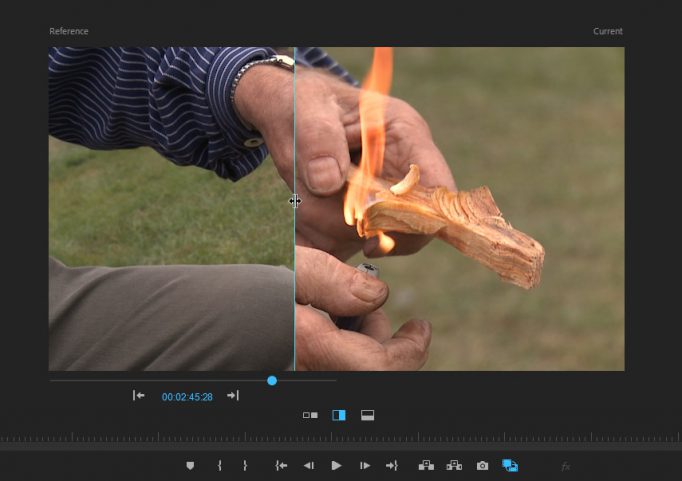
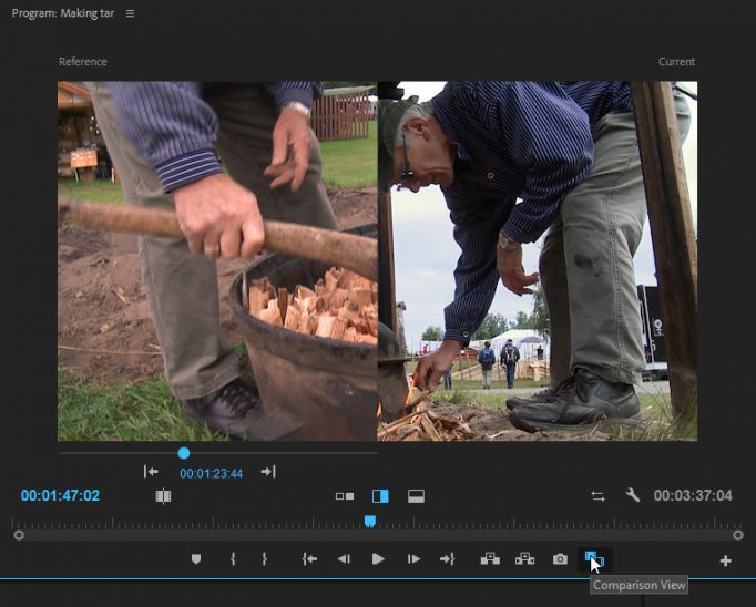
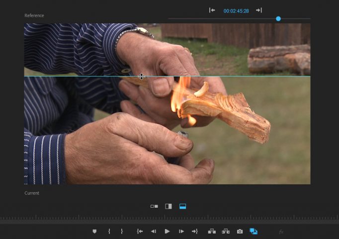
The Comparison View offers three different ways to compare shots and frames. Vertical, side-by-side and horizontal.
You can get into and out of Comparison View in a few different ways. The most obvious one is to click the new Comparison View button in the Transport controls, located in the lower right-hand portion of the Program Monitor. If it’s not there, click the big + sign to add it.
You’ll also find a Comparison View button in the Color Wheels & Match section of the Lumetri Color panel.
If, like me, you’re hiding the Transport Controls in the Program Monitor because you use keyboard shortcuts for all its features, you can assign a keyboard shortcut for toggling Comparison View, although only to activate it, not to change between the view options.
I’ve used F8 for toggling Comparison View on and off. Unfortunately, this keyboard shortcut only works when the Program Monitor is the active panel, which seems like an oversight, since you’ll probably be working in the timeline, the Effect Controls panel or the Lumetri Color panel when you want to compare shots. Let’s hope this changes in future versions.
Finally, you can enter Comparison View from the wrench menu in the Program Monitor, but I can’t see why anyone would want that.
Shot Comparison
The most common use of the Comparison View is to match different shots, and it’s also the most intuitive way to use it.
I use the side-by-side comparison a lot, and only switch to vertical and horizontal split view when I’m in doubt. But especially for matching skin tones, the two split views are very handy.
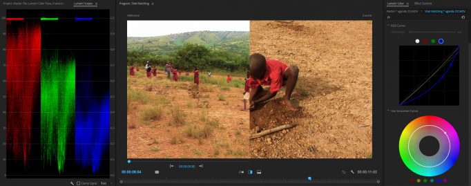
The Lumetri Scopes reflects the view in comparison mode, so you can see the two shots side by side. This is especially useful with waveform scopes in vertical split view.
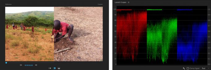
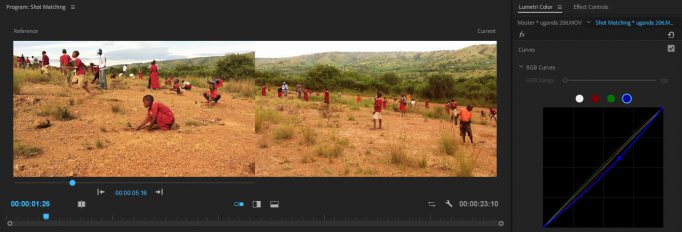
Vertical split view clearly shows that the image on the right has a lot more blue and a bit more green than the one on the left.
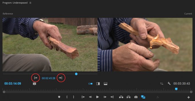
The slider on the reference side is of course a playhead, so you can use any reference frame you want. You can also click the forward or backward arrows to go through your clips and find the perfect reference frame.
This is quite intuitive and works fine for short timelines. In longer timelines with lots of cuts, it’s not accurate enough for my taste. Oh, well—it’s version 1.0 of the Comparison View, so it may improve in later versions. A different colored playhead in the main timeline would be great.
There are two buttons in the Comparison View that are easy to miss—the Shot or Frame Comparison button on the left, and the Swap Sides button on the right.
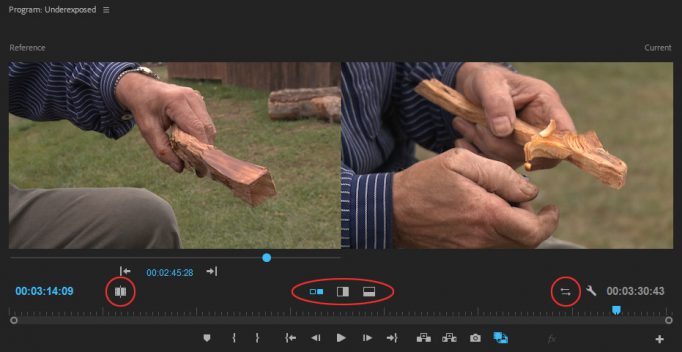
Most people see the buttons in the middle, but the two on the sides are often overlooked. They are the Shot Comparison and Swap Sides buttons, respectively.
The Swap Sides button does exactly what you’d expect: It swaps sides, so you can have the reference frame on the right, and the current frame on the left.
My brain is wired so that the result should be on the right, so I tend to keep it at the default setting. But swapping sides can be useful in split view, so you can see the opposite side of the two frames.
Frame Comparison
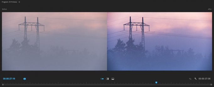
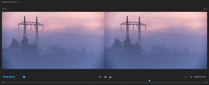
When you switch to Frame Comparison mode by clicking the Shot or Frame Comparison button, you get the same image on both sides.
This way, you can see what changes you’re making to color before you commit to the changes. So, in most cases, working in this mode is pretty straight forward. But there’s one thing you need to understand:
The “before” shot will stay in the buffer until you click out of Frame Comparison mode. When you enter this mode again, Premiere loads a new “before” image into the buffer.
So, if you click in the timeline, or switch to Shot Comparison mode, and then go back to Frame Comparison, you will see the same image on both sides.
So any changes you do now will be compared to how the image looked immediately before you entered the Frame Comparison mode the last time—not to the original image. The Current state in Comparison view is not the original state.
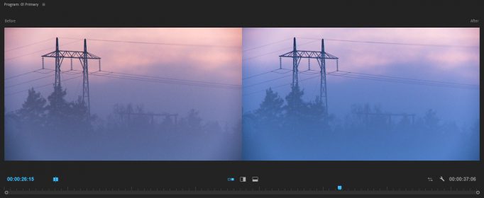
To trick Premiere into showing you the original image, toggle the Lumetri effect off by clicking the fx button in the upper left corner of the Lumetri Color panel and then exit Frame Comparison mode. Then enable Frame Comparison mode again to load the untouched image into the “before” buffer. Now you can re-enable the Lumetri Color effect and compare your adjustments to the original, untouched image.
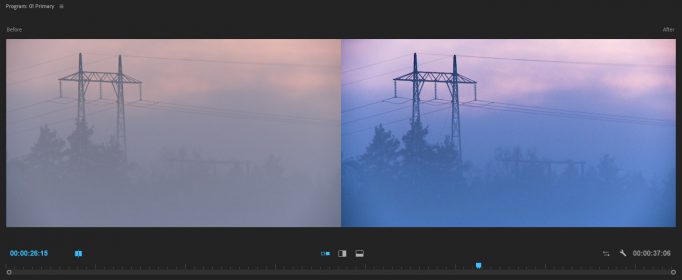
By temporarily disabling the Lumetri Color effect before entering Frame Comparison mode, we can compare our color tweaks to the original image.
Auto Color Match
Comparison View is great when you’re matching shots manually, but the spring 2018 version of Premiere also introduced Color Match, which can give you a head start. Color Match is powered by Adobe Sensei, which is an example of Adobe’s machine learning technology (it’s also the power behind other features like Content Aware Fill in Photoshop, automatic music ducking in Premiere, or Facial Recognition in Lightroom). It can use Face Detection to prioritize the skin tones over the other parts of the image. If there is more than one face, the face detection will focus on the one closest to the camera.
Machine learning can easily read black and white levels, but the midtones are a challenge. So, often you’ll only need to adjust the midtones after matching. Saturation is not adjusted by Color Match, so it will not work well with oversaturated images. Make sure you get the saturation of oversaturated images into legal levels before you do the match.
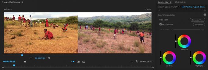
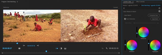
These three shots, shot on an iPhone, need some serious shot matching. The colors vary all over the place. Let’s see what Adobe Sensei can do with them.
In Comparison View, park the playhead over the hero shot, and move the playhead in the timeline to show the shot you want to match to the hero shot.
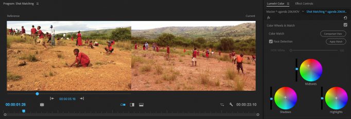
That helped a lot. What’s great is that even though the process is done by Adobe Sensei magic in the background, it’s still transparent. You can see what changes the machine learning did in the Color Wheels & Match section of the Lumetri Color panel, where all its adjustments are done. In this case the match is not bad, but it’s not perfect either. But we can tweak it further manually.
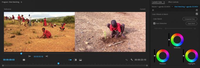
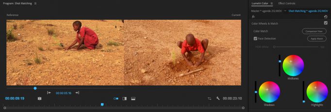
Now let’s see what Color Match can do with the other shot.
That’s not good at all! So, what’s going on here? The highlights areas in the hero image are the clouds and the sky. The highlights in the other shot are some sticks and stones on the ground. Let’s try to help the Color Match by temporarily taking away the sky in the hero shot. I do this by adjusting Scale and Position for that clip it in the Effect Controls panel.
Yes, I swapped the shots in the image above. It eases the manual comparison when the levels on the left and right of the frame are different. If you want to see shots both before and after the hero shot, you can open the Reference Monitor (Window > Reference Monitor) and scrub its timeline until you see the desired shot.
You could also load the sequence into the Source Monitor to get four monitors, all with different shots.
Looking at these shots, I found that there was a bit too much saturation, and the scopes confirmed that. Rather than adjusting each clip again, I used an Adjustment Layer on top of all the clips, with just two small tweaks: I lowered the whites and reduced saturation.
As you can see, the Color Match feature isn’t perfect, but it gets you very close to a finished result. And sometimes it’s spot-on. If you get the exposure into the ballpark before matching, this can increase accuracy.
Be aware that Color Match may reset your settings in the HSL Secondary section.
Scopes in Comparison View
The scopes behave as you’d expect in Comparison mode. In essence, they reflect what you see in the Program Monitor.
In Horizontal Split mode, the scopes show the full image, but there’s no visual split in the scopes. But when you start adjusting sliders and color wheels, you will see if the before and after levels are aligned or not.
Use Comparison View for Motion Graphics and Effects
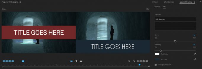
Comparison view is also very useful for other things than color grading. If you’re adjusting things in the Effect Controls panel or editing Motion Graphics Templates in the Essential Graphics panel, you can load the frame, including the state of all applied effects, into Comparison View before you start tweaking.
This has been an excerpt from an article I wrote for Frame.io about the Lumetri Color Panel. For the full article, with EVERYTHING there is to know about the Lumetri Color Panel, head over to Frame.io and immerse yourself in Lumetri knowledge.

